Yarra Valley Water
Helping a major water provider create an exceptional customer experience online.

Helping a major water provider create an exceptional customer experience online.


Yarra Valley Water (YVW) is an innovator and digital leader in the water industry. They saw their website redesign as an opportunity to set the standard in user-centered design for a water utility company in Australia. The Ackama team collaborated with YVW to make this a reality.
Tarnya McKenzie, Director of Marketing had a clear vision for how we should work together, and it paid off. “We went in with a really open mind about what the outcome should be. The plan was to find out what the customers want and build that.”
“Investing in the research didn’t put pressure on the budget, in fact, it was more cost effective”
Tarnya McKenzie, Head of Marketing.
Before Ackama could move into designs and development we needed a deeper understanding of YVW’s customers. We spoke directly to customers to better understand their needs which gave us the insights we needed to design the simplified digital experience users wanted and expected.
YVW provides a huge and varied range of services to the community. Often though, customers don’t give their water company much thought until they need to interact with them for a very specific task. It was important to find a way to help users find what they needed fast, without getting bogged down in the huge range of topics covered on the site.
We started tackling this with a content audit to remove any outdated information that didn’t need to be included. After considering key user tasks and removing anything unnecessary, more than 200 pages were stripped from the site.
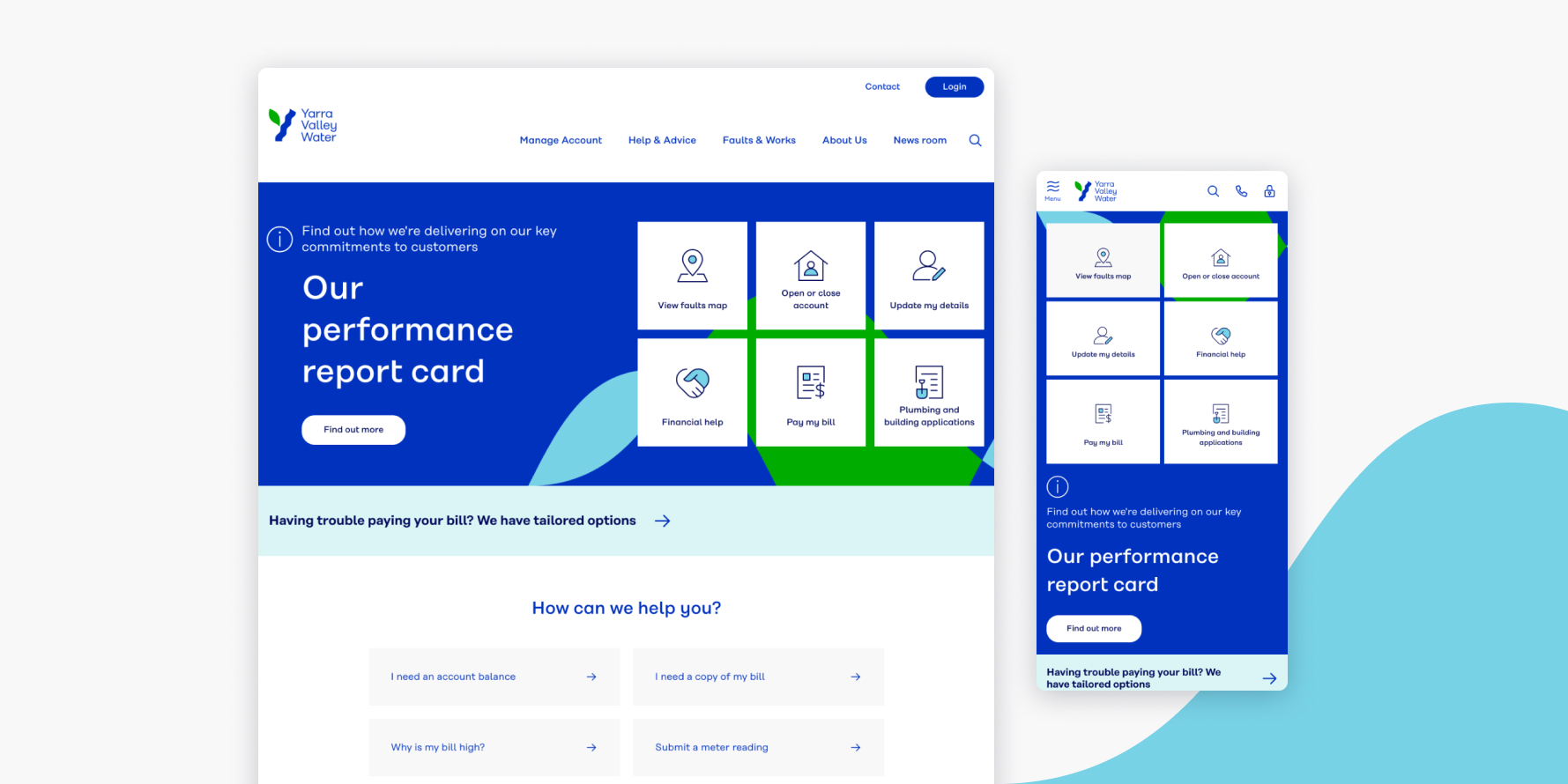
To make sure information was easy to find, we went through several rounds of user testing to refine the sitemap. The last step was to perfect the homepage – critical tasks were highlighted, and any interactions that weren’t essential to the customer were removed.

We built upon the solid, open source foundations in Drupal 8. Page load times were dramatically improved over the course of the project, and the editing experience was heavily customised to assist the YVW content editing team.
Drupal’s multiple caching layers and excellent support for external content delivery networks further improved the speed and experience for YVW’s customers.
After profiling the site with sophisticated performance analysis tools, we built out the hosting infrastructure with Drupal’s architecture and expected site load in mind.
Drupal’s vast community module repository allowed us to rapidly prototype a solution and get immediate feedback from YVW. The solid foundation of Symfony components in Drupal 8 led the way for further customisation. This ensured the content editing process was fast and easy for YVW content managers.
A site with a fresh look and feel that is easy to manage, puts customer needs first, and sets the standard for user-centred web design for water utility companies in Australia.
“We are very proud of what we have achieved, and it’s been great working to run this project with the focus on the customer.”
Megan Bata, Digital Communications Manager.
Squareweave is now Ackama.

We've merged with New Zealand company Ackama!
We're excited to be working with our Kiwi colleagues to deliver ambitious, purposeful digital products on both sides of the Tasman.
Common Code is now part of Ackama.

We’re now part of Ackama, delivering purposeful technology across the Asia-Pacific.
Together, we’re creating impact across energy, government, international development, and beyond. Delivering pragmatic, innovative solutions where they matter most.